Student residence District Living / DC Tower 3
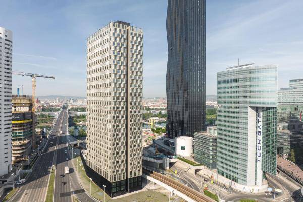
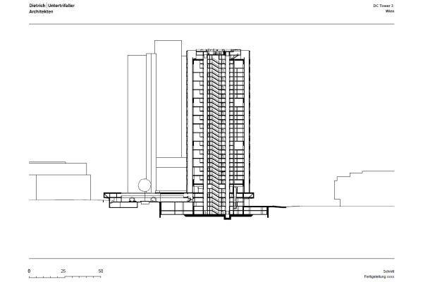
The District Living student dormitory makes use of a small gusset site in the middle of Donau City between business buildings, the subway line and the highway. No longer visible today - but decisive for the successful completion of the 110 meter high residential tower, was the special civil engineering, the perfect planning and the smooth cooperation with the construction company.
S+B Plan und Bau GmbH
Greystar
2022
Special civil engineering: i+R Spezialtiefbau GmbH
Construction company: Granit
Structural engineering: KS Ingenieure
Building services: die Haustechniker
Building physics: Dr. Pfeiler
Precast concrete parts: Kirchdorfer, Kölbl, Maba, Peikko
Floorspace: 23.900 m²
Hight: 110m
Apartments: 882
More: Fitness and event area, roof terrace, common rooms
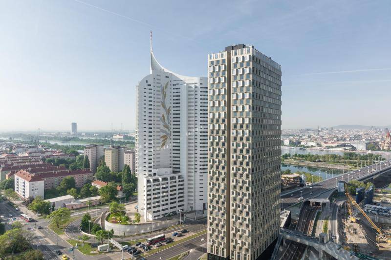
The comparatively small high-rise completed the ensemble with the two office towers DC 1 and DC 2 designed by Dominique Perrault. On several levels, the building is now connected on foot to the existing Donaucity neighborhood and to the transport network with public squares and paths and forms the missing completion of the Carl Auböck Promenade, which has been incomplete since the mid-1990s.
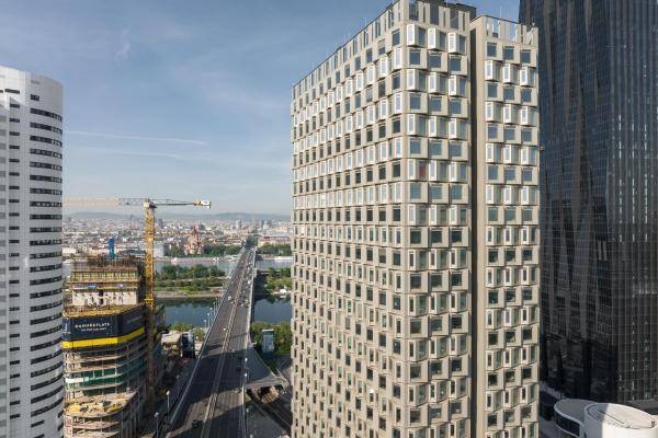
The wind calculations were also complex - as was the glazing, because on the one hand the residents should be able to enjoy a complete all-round view of the outside space, and on the other hand the traffic noise and the extreme wind loads and gusts on the slab had to be taken into account.
There are therefore no balconies, but there is a wind-protected and partially covered roof terrace that is available to all residents. The unusual façade design allows for special seating niches on the inside, each offering a view of the Danube and over the city.
The plot is actually a spandrel, a residual space that was never used. S+B Bau und Plan GmbH, together with the architects, developed a very cleverly used project from it. Dietrich|Untertrifaller Architekten provided the perfect design for it. Building to heights instead of wasting the resource of soil is hardly ever implemented in a building as exemplary as it is here.
A café with a large terrace enriches the hitherto open public space and incorporates the surrounding area. Although the base is on the ground floor, all rooms have views to the outside and daylight - the architects cleverly exploited the difference in height. Good use is also made of a so-called residual area, a separately accessible function room with a landscaped atrium, which also leads to a small, additional terrace via a staircase to the surface. The site is, after all, only 6,400 square meters in size and cut more crookedly than straight - but the architectural design extracted a small mini-city from the square.
The 832 apartments - ranging in size from 16 to 46 square meters - extend from the first to the 32nd floor and are equipped with a bathroom, small workspace and a kitchenette. The highlight of all the residential units is the heated seating windows and the views over the city. The rent is from around 600 to 1.500 euros, team on site, operating costs and the use of all common areas included. Another special feature is the prefabricated concrete elements for the bathrooms - which are no longer visible today.
The idea of prefabricated elements is not new, but in this case it is exciting because they are made of lightweight concrete, are erected in the factory hall completely ready for installation, and had to be hoisted 832 times to lofty heights.
(Text: Gisela Gary, Z+B Magazine; in shortened form)
